NorthvSouth
The client
Bespoke audio for premium clients
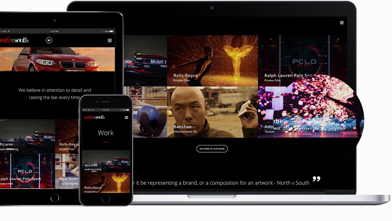
With a roster of high-end clients like McLaren, Rolls-Royce, Ralph Lauren, and BMW, the audio branding company NorthvSouth was looking for a new website. A company that works on building brand value, NorthvSouth knew the importance of a strong visual identity. It was important we craft a look that expanded on their branding guidelines and worked with existing key visuals to create a site that is cohesive and entertaining. Working with their existing logo, we collaborated with the client to ensure their page caters to their evergrowing premium client-base.
visitors
(seconds)
per session
time (seconds)
The branding

Logo
To maintain the continuity and reaffirm the visual language they had already established with their clientele, NorthvSouth provided us with their logo and asked we extrapolate their brands feel to the rest of the new website. Their existing logo is a logo mark created with a decorative serif font that is at once unique and highly memorable.
Typeface
As NorthvSouth’s brand hinges on a complex font, we wanted to create a soft contrast using a classic, simple and easy to read font, Open Sans. The straightforward, no-nonsense sans-serif font is practical in different sizes and screens. We combined different font weights to create a visual language that complements the pre-existing font without overshadowing or distracting from its personality.


Color scheme
Following the client’s branding guidelines, we applied black for backgrounds and big screens and white for text. To catch visitors to the website’s attention, we applied bright red as the main accent colour to use for banners, some buttons, and CTAs and CTA buttons.
Color scheme
Following the client’s branding guidelines, we applied black for backgrounds and big screens and white for text. To catch visitors to the website’s attention, we applied bright red as the main accent colour to use for banners, some buttons, and CTAs and CTA buttons.


