Project Taste
The client
Vintage inspired experience
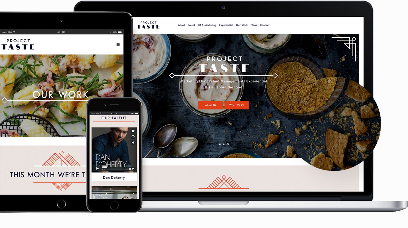
Project Taste is a high-end food & and beverage communications agency working with a broad selection of restaurants, caterers and chefs. They were referred to us by another happy MBJ client and needed a suitable platform to showcase their business to existing and prospective clients.
We worked in close contact with Project Taste to develop a new branding for the business that reflected their desire for an Art Deco inspired image. The end-result is a slick, new online presence that is striking and unique in its visual elements.
per session
(seconds)
browsing
monthly
The branding

Logo
We created a logo for Project Taste that was inspired by Art Deco style and features a notable contemporary embrace. The common characteristics of this style have been rendered with fresh elements, balancing a warm yet professional look and feel.
Typeface
The logo combines a geometric sans serif, Neutraface, with a customised Didone typeface. Keeping the strong contrast between the thin and thick lines of this typeface taking out the serifs gives a nice modern twist to the overall look. For the website, we used Futura, a timeless sans serif which is one the most prominent typefaces of the Deco style with its geometric form.


Color scheme
Instead of using glittered colours which are common in the Deco style of the early 20th century, we combined a bright, warm red for a contemporary touch. We stuck to the use of bold primary colours by combining this vibrant red with a dark navy colour.
Color scheme
Instead of using glittered colours which are common in the Deco style of the early 20th century, we combined a bright, warm red for a contemporary touch. We stuck to the use of bold primary colours by combining this vibrant red with a dark navy colour.


